
Warm Neutrals Set to Transform Interiors in 2026
Warm Neutrals Set to Transform Interiors in 2026
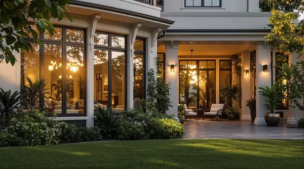
If you're preparing to sell your home—or simply want your space to feel more inviting—the paint colors dominating 2026 interiors may be exactly what you need. Warm neutrals like khaki, taupe, and creamy whites are replacing the cool grays that dominated for nearly a decade. Here in Florida and South Carolina, where natural light floods through windows and coastal living is all about relaxation, this shift is particularly well-timed.
In this guide, I'll explain why warm neutrals work—the psychology behind buyer perception, how these colors photograph in listing images, and the specific mechanisms that make khaki and taupe outperform cold gray. I'll also cover when this advice doesn't apply and what the research actually says about paint color ROI.
Key Takeaways
- Painting is Realtors' #1 recommendation before listing — According to NAR's 2025 Remodeling Impact Report, 50% of Realtors recommend painting the entire home before selling, more than any other project.
- Warm neutrals create "sanctuary" perception — The mechanism: buyers process warm tones as safe, comfortable, and inviting, which extends dwell time during showings and strengthens emotional connection.
- Color choice can add (or subtract) thousands — Zillow's 2025 study of 4,200+ buyers found navy bedrooms add ~$1,815 to offers, while bright yellow kitchens reduce offers by ~$3,915.
- Exception: Fresh paint can backfire — If your trim, doors, or cabinet faces are scratched or yellowed, new wall paint actually highlights those flaws. Budget for trim touch-ups first.
- Regional light matters — Florida's intense sun can make warm neutrals read yellower than expected; South Carolina's softer light allows richer khakis and deeper taupes.
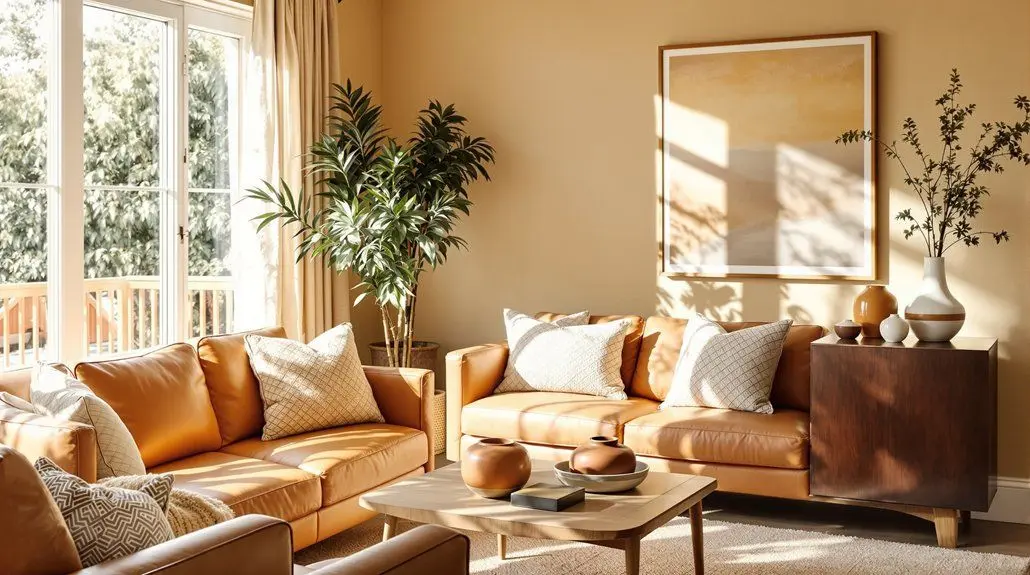
Why Warm Neutrals Are Replacing Cool Grays
For nearly a decade, cool gray dominated interiors—often called "millennial gray" by designers. But that trend is shifting decisively. Sherwin-Williams named Universal Khaki their 2026 Color of the Year, and other major paint brands are following suit with warm, grounded tones: Benjamin Moore's Silhouette (espresso-charcoal), Valspar's Warm Eucalyptus, and Dutch Boy's Melodious Ivory.
The mechanism behind the shift: Cool grays can feel clinical or institutional, especially under certain lighting conditions. Warm neutrals, by contrast, create what designers call "sanctuary-like environments"—spaces that signal safety, comfort, and intentional refuge from external stress. This isn't just marketing language; it reflects how our nervous systems respond to color temperature. Warm tones lower visual stimulation and trigger associations with natural materials like linen, sand, and clay.
As Sue Wadden, Sherwin-Williams' director of color marketing, explained when announcing Universal Khaki: "It's pretty serious time culturally across the globe. A structured, foundational color is the right story to tell right now."
How Paint Color Actually Affects Home Value: The Evidence
Let me be direct about what the research shows—and what it doesn't. Paint color can influence buyer perception and offer prices, but the effect is more nuanced than simple "warm = good, cool = bad."
What NAR's data tells us: According to the 2025 Remodeling Impact Report, painting is the most recommended pre-listing project—50% of Realtors suggest painting the entire home, 41% recommend painting at least one room. Americans spent an estimated $603 billion on home remodeling in 2024, and cosmetic updates like paint consistently rank among the most cost-effective improvements.
What Zillow's research found: In June 2025, Zillow's behavioral science team surveyed more than 4,200 recent and prospective buyers. Participants were shown homes with interiors painted in different colors and asked about their willingness to buy and how much they'd offer. The results challenge some assumptions:
| Room + Color | Effect on Offer Price | Why It Works (or Doesn't) |
|---|---|---|
| Charcoal gray living room | +$2,593 | Creates cocooning effect; feels intentional |
| Navy blue bedroom | +$1,815 | Signals restful sanctuary; feels premium |
| Olive green kitchen | +$1,597 | Associated with organic modernism trend |
| Mid-tone brown bathroom | Highest for bathrooms | Warmth + grounding (Pantone 2025 COTY influence) |
| Bright yellow kitchen | -$3,915 | Too personal; buyers see it as work to undo |
| Bright red bedroom | -$1,987 | Signals bold personal taste; doesn't read as restful |
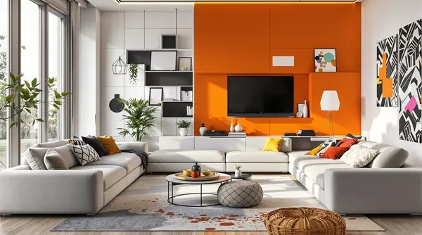
The important nuance: Notice that stark white didn't top any category. Bolder, nature-inspired tones outperformed "safe" whites in Zillow's analysis. The mechanism isn't just about being neutral—it's about demonstrating design intentionality. Buyers pay premiums for homes that feel thoughtfully curated and move-in ready.
Why Warm Neutrals Work: The Mechanism Behind Buyer Perception
Understanding why warm neutrals influence buyer perception helps you make smarter decisions—rather than just following trends blindly. Here's what's actually happening:
1. Photography and Listing Presentation
Warm neutrals photograph consistently well across different lighting conditions. Cool grays can read as blue or purple under certain light sources, which makes rooms appear smaller in listing photos. Warm beiges and greiges maintain their true tone across morning sun, cloudy days, and artificial evening light. Since 95% of buyers start their search online, how your home photographs matters enormously.
2. Psychological "Sanctuary" Response
Warm tones trigger associations with natural materials—sand, clay, linen, weathered wood. These associations signal comfort and safety at a subconscious level. When buyers walk into a warm-toned space, their nervous system response is "I could relax here," which translates into stronger emotional connection and willingness to pay.
3. "Move-In Ready" Signal
Fresh, neutral paint signals maintenance and care. It tells buyers "this home has been loved and updated." Dated or bold colors, conversely, signal work—even if repainting is relatively inexpensive, buyers mentally add it to their to-do list and discount their offer accordingly.
4. Flexibility for Buyer's Vision
Warm neutrals create a backdrop that lets buyers project their own furniture, art, and lifestyle onto the space. Bold colors make that mental exercise harder—buyers get stuck on "I'd have to change that" instead of "I could see myself here."
Universal Khaki (SW 6150)
Sherwin-Williams' 2026 COTY. A mid-tone tan with subtle softness that works as a foundation neutral. Best in bright, south-facing rooms where its depth prevents spaces from looking washed out.
Melodious Ivory (Dutch Boy)
A creamy, warm neutral that mimics golden-hour light. Best in north-facing rooms or hallways with limited natural light—the yellow base artificially warms up cool spaces.
Accessible Beige (SW 7036)
A true greige (gray-beige hybrid) that reads warm without going yellow. Versatile foundation that works with both warm wood tones and cooler elements.
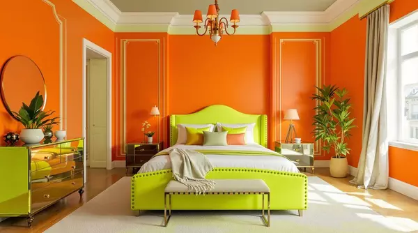
Silhouette (BM AF-655)
Benjamin Moore's 2026 COTY—a rich espresso-charcoal blend. Best for accent walls, cabinetry, or bedrooms where deeper tones create cocooning effect.
Get a free home evaluation to see your current market value—before deciding on any updates.
Get Your Free Evaluation
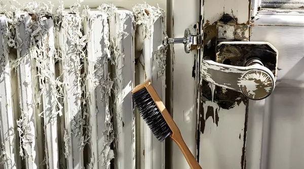
When Fresh Paint Doesn't Help (or Could Backfire)
Paint is one of the most cost-effective pre-listing improvements—but it's not always the right move. Here's when fresh wall paint can actually hurt your presentation:
- Damaged trim, doors, or baseboards — Fresh wall paint next to scratched, yellowed, or chipped trim creates unflattering contrast. The new paint highlights the old trim's condition. Budget for trim touch-ups first, or reassess whether the scope is still a "refresh."
- Cabinet faces in poor condition — If your kitchen cabinets are scratched, peeling, or outdated, fresh wall paint draws attention to that contrast. Consider whether cabinet refinishing should come first.
- Walls with underlying damage — Paint doesn't hide water stains, cracks, or texture issues—it often makes them more visible. Address repairs before paint.
- Historic homes with period details — In Charleston's historic districts, period-appropriate colors may matter more than contemporary trends. Buyers of historic properties often have specific aesthetic expectations.
Defining "refresh" vs. "renovation": A refresh means cosmetic updates you can complete in a weekend without permits or contractors—paint, hardware, light fixtures, landscaping cleanup. Once you're into drywall repair, plumbing, or electrical, you've crossed into renovation territory, which has different timelines, costs, and ROI considerations.
Warm Neutrals in Florida vs. South Carolina: Regional Considerations
Our Southern coastal markets share abundant natural light and relaxed lifestyles—but light quality differs in ways that affect paint selection.
| Factor | Florida (Tampa Bay) | South Carolina (Charleston/Lowcountry) |
|---|---|---|
| Light Quality | Bright, intense sun; warm neutrals can read yellower than expected | Softer, filtered light allows richer taupes and deeper khakis |
| Recommended Approach | Choose slightly cooler-undertone warm neutrals (greige over beige) | Can go warmer and richer; heritage taupes work beautifully |
| Popular Styles | Contemporary coastal, Mediterranean, resort-style | Lowcountry traditional, Southern coastal, historic charm |
| Best Accent Pairings | Ocean blues, soft corals, natural greens | Forest greens, tobacco browns, muted navy |
The testing method that matters: Always paint samples on foam core boards (not directly on walls) and observe them in morning, afternoon, and evening light over several days. Take photos with your phone—the camera often reveals undertone clashes the eye initially misses. If your existing furniture is cool gray and the paint reads warm taupe, you'll see the conflict immediately in photographs. Browse homes in Tampa or Charleston to see how different palettes present in local listings.
Your Pre-Painting Assessment Checklist
- Trim condition — Is it scratched, yellowed, or chipped? Address first if so.
- Wall repairs needed — Fill holes, fix cracks, and address water stains before paint.
- Cabinet/door condition — Fresh walls highlight tired cabinetry. Plan accordingly.
- Light exposure by room — South-facing vs. north-facing rooms need different undertones.
- Flooring and countertop compatibility — Ensure warm neutrals complement, not clash.
- Sample testing complete — Observe samples over multiple days in varied lighting.
Searching for Your Coastal Home?
Browse move-in-ready homes across Florida and South Carolina—see how different palettes present in real listings.
Frequently Asked Questions
How long will the warm neutral trend last?
Interior design trends typically cycle every 7-10 years, but warm neutrals have staying power because they address a fundamental human preference for comfort and sanctuary—not just a style moment. Cool gray dominated for roughly a decade; warm neutrals are positioned as the next multi-year foundation. Unlike trendy accent colors, warm neutrals age gracefully rather than looking dated within a few years.
Should I repaint my gray walls before listing?
Not necessarily. If your gray is a warm greige in good condition, it may still appeal to buyers—Zillow's research showed charcoal gray living rooms can add nearly $2,600 to offers. The key is whether your specific gray reads cold or warm under your home's lighting. However, if your gray has blue or purple undertones and feels clinical, updating to a warmer neutral is likely worth the investment. Fresh paint in any neutral signals maintenance, which matters as much as the specific color.
What's the actual ROI on interior painting before selling?
NAR's data shows painting is the #1 recommended pre-listing project by Realtors, and cosmetic updates like paint typically have favorable cost recovery because the investment is relatively low. However, exact ROI varies by your home's current condition, local market, and buyer expectations. Paint is most valuable when it addresses dated or bold colors, signals maintenance, and photographs well—but it won't compensate for deferred maintenance in other areas.
Can warm neutrals work in small or dark rooms?
Yes—often better than cool tones. Warm neutrals add a welcoming glow that makes rooms feel intentional rather than cramped. For north-facing or low-light rooms, choose warm neutrals with yellow undertones (like Melodious Ivory) to artificially warm up the space. Avoid using deep khakis in dark rooms, which can read muddy; save richer tones for bright, south-facing spaces.
What lighting works best with warm neutral walls?
Warm white bulbs (2700K-3000K) complement warm neutral walls far better than cool white or daylight bulbs, which can create visual conflict. Brass, copper, and brushed gold fixtures enhance the warmth beautifully. Avoid stark chrome or bright white LEDs, which undermine the cozy atmosphere warm neutrals are designed to create. Pendant lights with amber glass or linen shades diffuse light perfectly against taupe or khaki walls.
How does Florida's light differ from South Carolina's for paint selection?
Florida's intense, direct sunlight can make warm neutrals read yellower than their true tone—what looks perfect in the paint store may feel too golden on your walls. South Carolina's softer, more filtered light allows you to use richer khakis and deeper taupes without that yellow shift. In Florida, consider warm neutrals with slightly cooler undertones (greige over pure beige) to balance the intense light; in Charleston, you can go warmer and richer.
Making Warm Neutrals Work for Your Home
The shift from cool grays to warm khakis and taupes isn't just a design trend—it's a response to how we want to feel in our homes. After years of stark, industrial-inspired interiors, the industry is recognizing that people crave warmth, comfort, and spaces that nurture.
For sellers in Florida and South Carolina, this shift is practical good news. Warm neutrals photograph consistently well for listings, appeal to relocating buyers from across the country, and create the sanctuary-like atmosphere that makes people linger—and make offers. For buyers exploring Tampa, Wesley Chapel, Charleston, or Summerville, understanding these palette choices helps you evaluate staging and envision how you might personalize your new space.
Whether you're preparing to sell, settling into a new home, or simply refreshing your space, the key is understanding why these colors work—not just following trends blindly. When you understand the mechanism (photography, psychology, maintenance signaling), you can make smarter choices that fit your specific home, lighting, and market.
Recent Posts


GET IN TOUCH